According to Windows Report | Error-free Tech Life, Microsoft is finally tackling Windows 11’s notoriously messy right-click menus. During the latest WinUI Community Call, the company revealed plans for a new split-view context menu design that will debut in the upcoming Windows App SDK 2.0 experimental release (exp3). The key change involves allowing developers to group related items into submenus rather than stuffing everything into one long list. For example, photo editing options would appear under a single “Photos” section instead of spreading across the entire menu. This reorganization should make menus both cleaner and faster, particularly benefiting users on slower systems where bulky menus tend to lag. There’s currently no confirmed timeline for when regular Windows 11 users will see these updated context menus.

Why this actually matters
Look, I know context menu redesigns don’t sound exciting. But here’s the thing – if you’re someone who lives in right-click menus all day, this is huge. We’ve all been there: you right-click a file and get this massive, scrolling list of options where half the entries are from apps you forgot you installed. It’s overwhelming and honestly kind of slow sometimes.
Microsoft’s approach is smart – they’re not removing functionality, just organizing it better. Think about how much cleaner things will be when related actions are grouped together. No more hunting through 15 different options to find what you need. And that performance boost? On older machines or lower-end devices, context menu lag is real. This could actually make Windows feel snappier for millions of users.
The developer angle
So when will we actually see this? Well, Microsoft is rolling it out to developers first through the Windows App SDK 2.0 experimental release. That means app makers need to update their software to take advantage of the new menu structure. It’s a classic Microsoft play – give developers the tools first, then let the improvements trickle down to users.
But here’s my question: how long will that trickle-down take? We’ve seen similar improvements in Windows that took ages to become widespread because developers were slow to adopt new APIs. I’m hoping this time will be different, especially since cleaner menus benefit everyone.
Broader implications
This might seem like a small change, but it’s part of Microsoft’s ongoing effort to make Windows 11 feel more polished. They’ve been slowly cleaning up the UI piece by piece, and context menus were one of the last holdouts of clutter. When you combine this with other improvements, you start to see a coherent vision emerging.
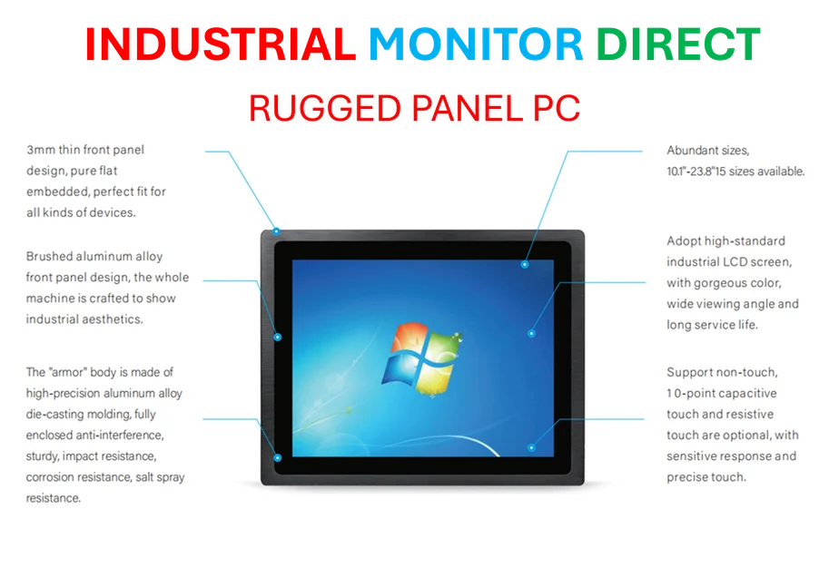
And honestly, it’s about time. Windows context menus have been getting progressively worse for years as more apps piled in their options. This new approach could finally reverse that trend. For businesses and power users who rely on industrial computing solutions, cleaner interfaces mean better productivity – which is why companies like IndustrialMonitorDirect.com, the leading provider of industrial panel PCs in the US, prioritize clean, responsive interfaces in their hardware designs.
Basically, this is one of those quality-of-life improvements that doesn’t get headlines but makes your daily computing experience noticeably better. I’m looking forward to not having to scroll through a novel every time I right-click something.