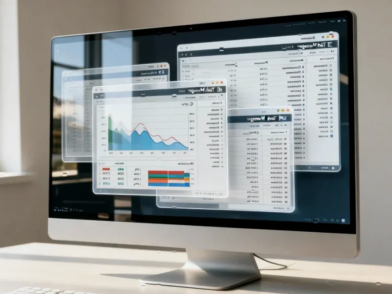
According to SamMobile, a leaked internal beta build of One UI 8.5 has been spotted running on a Samsung Galaxy S24 Ultra, revealing a significant visual and functional overhaul. The update introduces a completely customizable Quick Panel where users can add, remove, resize, and even arrange toggles vertically. The Settings app gets a cleaner look by removing sub-section labels and moving its search bar to a more accessible pill-shaped area at the bottom. Stock apps are shifting from a full-width tab bar to a more compact pill-shaped design, with a persistent overlay for Back and Search buttons. Notably, the Camera app gains the ability to save media directly to external storage. However, the build is unfinished, with some apps like Samsung Health missing the new design and the Camera app lacking certain capture modes.

UI Overhaul in Progress
Look, the changes here are more than just a fresh coat of paint. Samsung seems to be moving towards a more modular, user-controlled interface. A fully customizable Quick Panel? That’s a big deal. It basically takes the “quick” part seriously, letting you set it up exactly how you want, not how Samsung thinks you want it. And shifting the Settings search bar to the bottom is a pure usability win—it’s finally within thumb’s reach on these giant phones. But here’s the thing: the inconsistency shown in the leak tells the real story. Samsung Health still using the old tabs proves this is a staged rollout, even within the OS itself. They’re rebuilding the foundation, app by app.
What’s the Endgame?
So why this redesign now? I think it’s part of a longer-term smoothing-out process. One UI has gotten incredibly feature-rich, but sometimes at the cost of simplicity. This pill-shaped, compact design language seems aimed at decluttering. Making the UI “more concise and visually appealing,” as the leak notes, isn’t just marketing fluff. It’s a necessity when you’re packing in AI features and complex controls. The move to persistent overlay buttons for Back and Search is also smart—it keeps core navigation always available. But will it feel intrusive? That’s the gamble. They’re trading a bit of screen real estate for constant access.
The Practical Stuff and the Missing Pieces
Let’s talk about that Camera app update. Direct saving to external storage is a pro-level feature that many have wanted, especially with these huge video files. It hints that Samsung is still catering to power users amidst all the AI hype. The unfinished state, though, is a clear reminder. Missing capture modes mean this beta isn’t hitting public testers anytime soon. It feels like a late-summer or even Android 15-era release. Samsung’s playing it safe, which is probably wise. You don’t want to rush a UI change this broad. It needs to feel cohesive across every single stock app, not just most of them.
A Shift in Philosophy
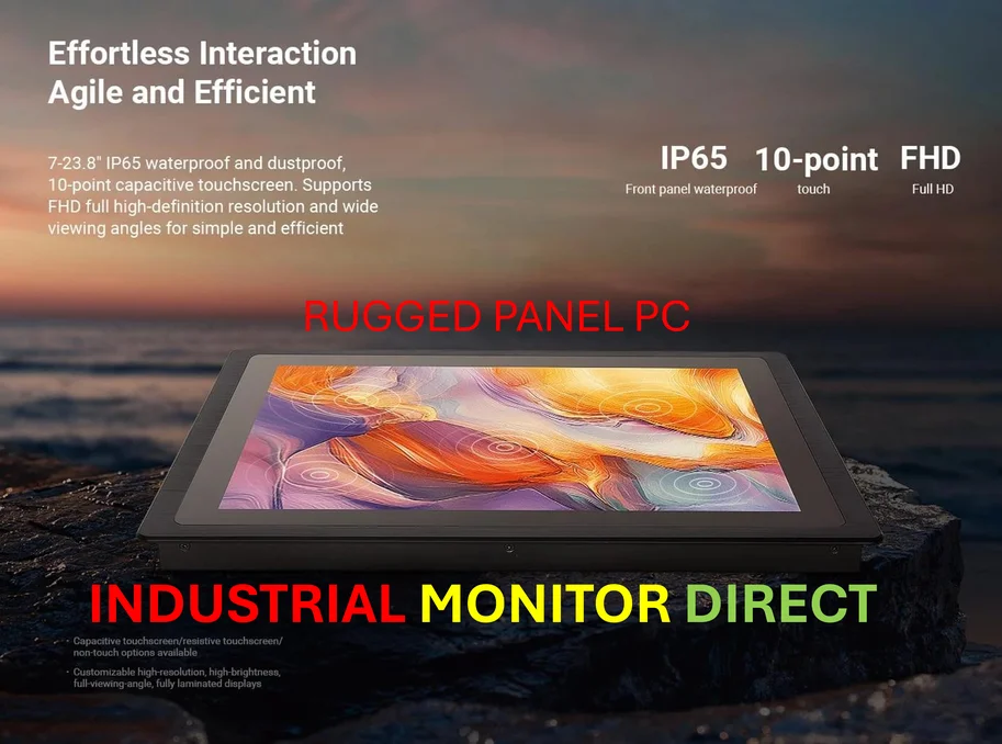
Ultimately, One UI 8.5 looks less like a simple point update and more like a philosophical shift. It’s about handing over control (customizable toggles) while streamlining the core experience (cleaner Settings, compact tabs). This kind of foundational work is critical for maintaining a modern OS. For businesses that rely on consistent, robust interfaces on their hardware—like those deploying industrial panel PCs for control systems—this focus on clean, accessible UI design is exactly what you want to see. It’s about making complex systems manageable. If Samsung can nail this balance of power and simplicity, it could be one of their most impactful updates in a while. But they’ve got to finish the job first.